Welcome to a special eighteenth episode of the Kit Nerd Corner podcast, a reaction to the release of the new kits from Canada Soccer, with the whole crew!
LISTEN ON
Stitcher · Spotify · Apple
Canada Soccer and Nike just released their shirts for 2024. And some people aren’t happy with them.
Us. It’s us who aren’t happy with them.
Enjoy!
—
Episode rundown, with times bolded:
0:00 – INTRODUCTION
Intro music: Definition by Black Star (Mos Def and Talib Kweli)
Kristin is back! We’re Canadian!
2:00 – NEW 2024 CANADA SHIRTS BY NIKE
Canada get a bespoke set of kits for the first time in this Nike contract!
Unfortunately this means the women will be losing their wonderful black and red maple leaf kit, booooooooo.
So, how did Nike and Canada Soccer do?
3:30 – HOME KIT
- 5:00 – Mark, on the colours and sleeves
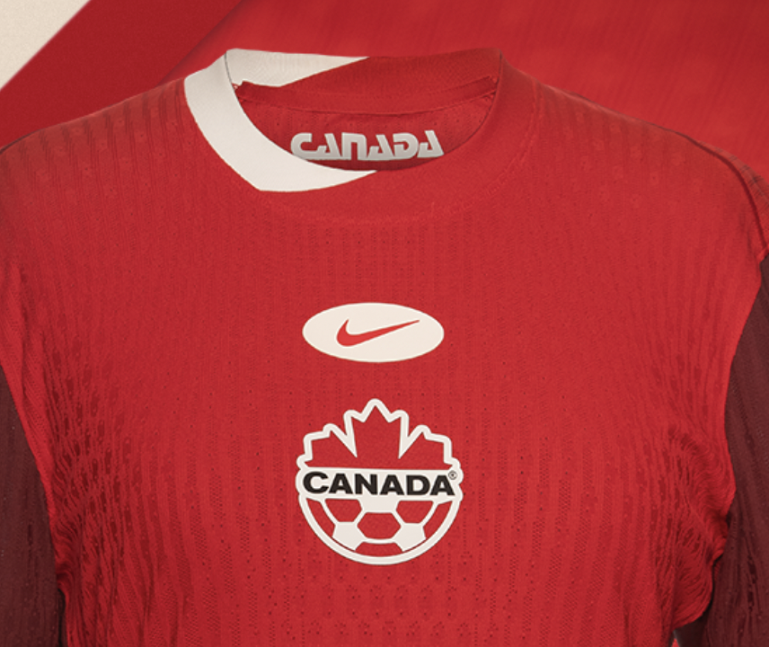
- 7:00 – Kristin hates centred logos and badges
- 9:35 – Rich loves the collar (wait, there’s a twist)
- 11:00 – Kit teaser – it looked really good!
- And so, so much more…
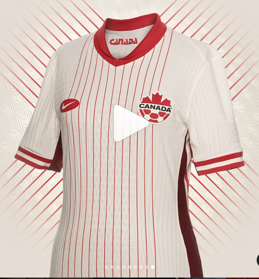
20:00 – AWAY KIT
13 provinces and territories! Two collars!
- 23:15 – No one likes this poor shirt
- 30:45 – Rich digs into why the 13 pinstripes don’t work
- 32:10 – Mark wants an inukshuk on the chest
33:05 – SUMMARY
We are all disappointed and mad. “Fucking abysmal” was said. “An attempt was made” was also said.
They’ll look better in person, right? Right?
37:35 – OUTRO
Look for an upcoming episode where we look at all the new Canadian Premier League shirts for 2024!
Outro music: Magical Colors by the Jon Spencer Blues Explosion
See below for images of all the shirts we talk about, and jump on over to twitter to let us know what you think about all our blathering.
The podcast: @KitNerdCorner
Mark: @kitnerdmark
Kristin: @kzknowles
Rich: @teaathalftime
Brenton: @capsoffside
Shirts we discuss in this episode
New Canada away shirt
This is what we had: Women on the left, men on the right. (This is the 2022 World Cup kit for the men, not the current and worse 2023 shirt.)
Here is the teaser of the new kit from Canada Soccer. Looks great, hey?

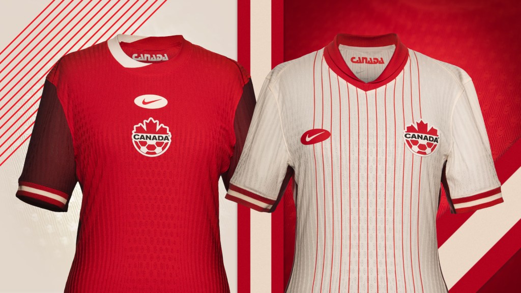
And here’s the full home kit. Looks better on a player, I guess? Sleeves, cuff and texture detail.


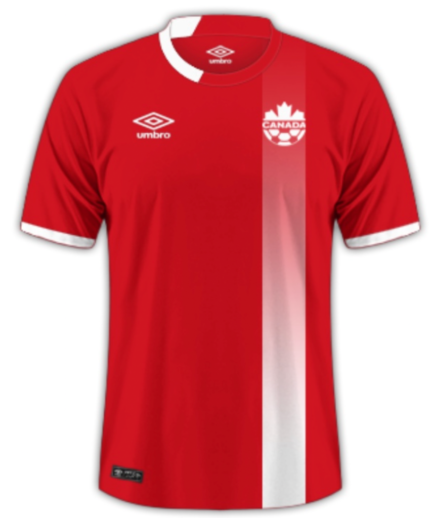
This is a weird collar. There’s the collar on the US kit that seems way more topical. And there’s the 2016 home by Umbro with the similar collar.

Nice socks, though…

Full away kit
Those centred 13 pinstripes…
Decent cuffs, though? And at least the logos aren’t centred.

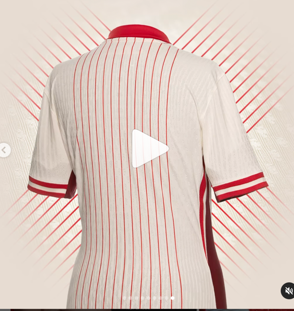
Top: Screenshots from a fun 3D rendering video, showing the odd maroon highlights on the side.
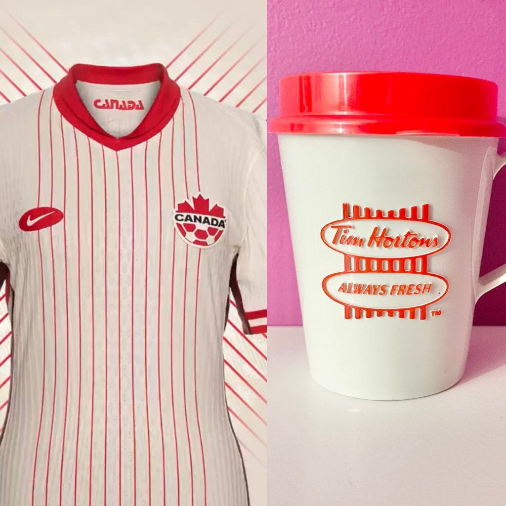
Bottom: Tim Hortons comparison by @katetigchelaar; and double neck detail.

13 provinces and territories, you say? How about the provincial and territorial crests sublimated into the full body and sleeves, as in the 1996 home by Umbro.

And that’s it. Thanks for reading along, gang. Enjoy soccer!

Leave a comment